

WordPress has come a long way since its humble beginnings as a blog-specific platform. Now the open source platform hosts sites of all types (from blogs to ecommerce). Because the global default is slowly evolving to a mobile-first frame of mind, it’s become increasingly important that your site be smartphone- and tablet-friendly.
How can you achieve such a feat? Fortunately, there are plenty of WordPress plugins that will make your site as easily viewable on mobile devices as it is on desktop devices. I’ve found five such plugins that I feel help to make your WordPress site as mobile-friendly as possible.
Let’s take a look.
WPTouch
If you’re looking for a plugin that offers plenty of features, but won’t bog you down in the minutia of having to edit CSS or deal with too many settings, WPTouch might be exactly what you’re looking for. WPTouch doesn’t modify your theme, so all of that hard work you’ve done with the look of your site won’t change. This plugin also uses the same URL for desktop and mobile versions. WPTouch has plenty of features (such as include/exclude pages, Google Mobile Friendly, 20 languages, easy switch between mobile and desktop, ad support, compatible with most WP themes, and much more). This particular plugin is very simple to set up. Once installed, you’ll find an entry for WPTouch in the WordPress sidebar. Click on that to reveal the well-designed Settings window (Figure A).
Figure A
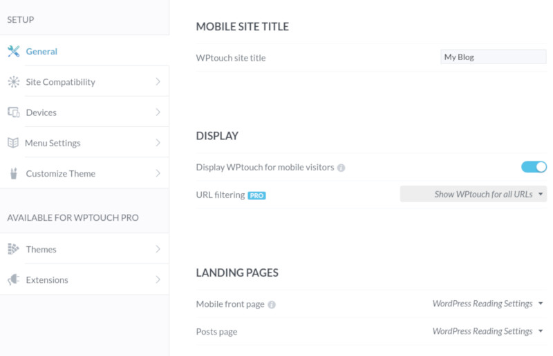
The WPTouch Settings window.
WPTouch offers a free version as well as a few variants of the Pro version: Pro, Business, Developer, and Enterprise. For more information on pricing and features, check out the matrix here.
WP Mobile Edition
If you’re looking for a plugin that will render your website as if it were a mobile app, WP Mobile Edition does the trick. Although the default theme isn’t the most modern looking (Figure B), how this plugin renders your site for mobile devices is pretty amazing. NOTE: There are more mobile themes planned for WP Mobile Edition.
Figure B
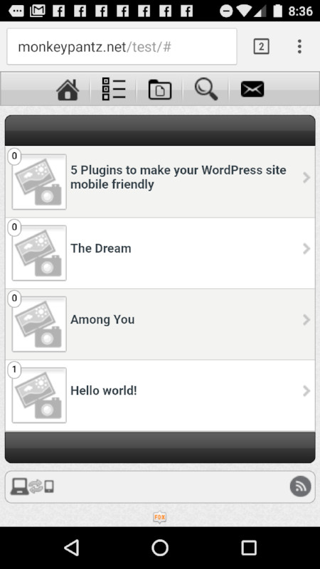
Your website as an app, as shown on the OnePlus 3.
WP Mobile Edition features include:
- Manual Mobile Switcher (so your users can switch between desktop and mobile version)
- Standard mobile theme (designed to be lightweight and includes eight color schemes)
- Easily configure what you want in the menu
- Add your own site logo and bookmark icons
- Include top and bottom advertisements
- Easy to set up contact page
This simple plugin also allows you to include your social links. However, when you attempt to add them and save the changes, the site will return a 403 error. Hopefully this issue will be addressed soon.
WordPress Mobile Pack
Looking to turn your site into a functioning work of art? If so, you’ll want to look into WordPress Mobile Pack. With a beautiful default theme and a functionality that’ll make your site more user-friendly than you can imagine, this particular plugin is a must-have for those looking to make the most out of mobile devices. Not only will you find the end results stunning, but the setup itself is pretty sweet. There are four tabs to visit on your road to completion (Figure C), with an additional Pro tab that offers even more features.
Figure C
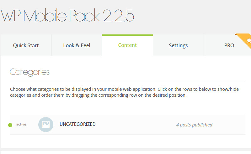
The WordPress Mobile Pack offers an incredibly simple to use control panel.
The feature set for WordPress Mobile Pack includes:
- Cross-platform, HTML5 compatibility allows instant access to all of your content
- Responsive UI that is sensitive to various screen sizes and orientations
- Theming allows for a mobile, native app-like look and feel (more themes available in the PRO version)
- Customize themes with fonts, colors, logos, and more (more options available in PRO)
- Posts are automatically organized into the corresponding categories for the mobile site
- Show/hide pages according to your needs
- All the comments on your site are automatically synchronized into the mobile web application
- WordPress Mobile Pack 2.0 easily integrates with Google Analytics
- Readers can add the mobile web app (your site) to their homescreen
You can purchase the PRO version here ($69.00 USD), which includes the above and adds:
- 5 App Themes (fully customizable)
- Social Features (Facebook, Twitter Google+)
- Monetization Options (Google AdSense Doubleclick for Publishers)
- 1 Year of Professional Support
- Ongoing Features Security Updates
- Single WordPress Site License
Mobilize
Mobilize is a plugin to add when you want to retain the look and feel of your desktop site, but need just enough ease of use for mobile devices. What this plugin does is add a simple mobile-friendly menu to your site. You can either create a new menu, specific for mobile devices, or you can simply add your current site menu to the Mobilize Navigation location (Figure D).
Figure D

Adding a new menu to the Mobilize menu button.
There’s not much more to this particular addon; but if you’re looking to retain your site layout, even for mobile devices, while including just enough ease of use, Mobilize is what you’ll want.
Any Mobile Theme Switcher
Any Mobile Theme Switcher does something special: It detects what browser the user is working with and then loads a theme that you (the administrator of the WordPress site) has assigned to that particular browser. Why would you want to use such a plugin? Because sometimes a particular browser won’t render your site exactly how you want it. This way you can ensure the browser being used is capable of getting the best possible experience from your site.
Associating a theme to a browser is as simple as going to Settings | Any Mobile Theme and then selecting the theme for each browser (Figure E).
Figure E

Associating themes to browsers is quite simple.
Any Mobile Theme Switcher doesn’t do much, but what it does do can help make sure your site works well with every mobile browser.
There’s always more
If you search through the WordPress plugin repository, you’ll find plenty of available tools to help make your website more mobile friendly. Considering mobile device usage now outpaces desktop usage, it’s more important than ever that your site render and behave on every type of device.