Late in 2015, Google confirmed what many of us had already suspected: mobile search had officially surpassed desktop worldwide.
Smartphones and tablets have completely disrupted and forever altered what was once a fairly linear buyer’s journey. These days, a consumer might drop into your funnel at any point, from any channel, and it might be after an unknown number of touch points across platforms and devices that you didn’t see happening.
They’re reading reviews, are exposed to organic and paid social, are searching for nearby answers for their immediate needs and more. Increasingly, consumers are doing all of these things from a mobile device.
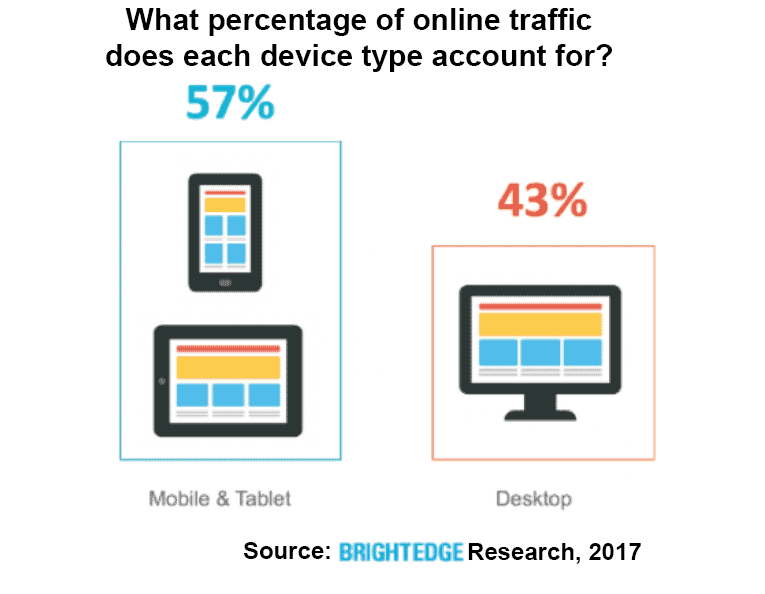
Recent research at BrightEdge (my company) shows that 57 percent of all online traffic now comes from mobile and tablet. Pair this consumer insight with the knowledge that Google’s mobile-first algorithm is coming, and we marketers have some work to do.
In this column, I’ll share the results of our recent Google SERPs Mobile vs. Desktop research, and you’ll learn how to Google-proof your SEO and content marketing strategies to prepare for what’s next.

Why mobile matters
As the shift to mobile has picked up speed, we’ve discovered some new ways to determine what that actually means in terms of real, measurable impact on businesses.
One such insight gleaned from our recent research helps us assess the extent to which mobile matters to Google. We’ve been tracking Google’s experimentation with the mobile-first index since it was announced in 2016, and what we learned might surprise you.
We tracked SERP listing data for nearly 25 million keywords, and what we discovered is that 79 percent of listings have a different rank on mobile and desktop devices. For listings in positions 1-20, 47 percent had mobile and desktop rankings that were not the same.
Furthermore, we found that 35 percent of the time, the top-ranking URL of a domain for a given query is different on desktop than on mobile.
Preparing for mobile-first
Back in 2016, Google first announced their development of a mobile-first algorithm, a direct response to the rising use of mobile across its consumer base. Now, the search giant has begun experimenting with this new algorithm — a test that’s attracted the attention of marketers across all sectors.
It’s impossible to estimate the impact of such an algorithm, yet it’s safe to say you need to start preparing now. Brands that are still looking at their marketing strategy through a desktop view in a mobile-first world are likely to misunderstand the opportunities and threats affecting them (most likely on the mobile side, and in their largest channel — organic search — which accounts for 51 percent of traffic, on average).
But mobile-first isn’t mobile-only, either. Those who come out ahead through this upcoming mobile-first update will have separate strategies for each and will be tracking performance across both. Carlos Spallarossa, director of SEO for cosmetics giant L’Oréal (a client of my company) says,
“Mobile traffic is huge for us and our industry — above the 57 percent [this survey] is reporting. We are developing content with a mobile-first perspective to connect with our users with info, user advice, and reviews – especially when they are near a store where they can easily purchase.”
Winning in this rapidly evolving environment requires a keen understanding of user intent, how your customers use mobile and how your site appears on mobile devices.
Google interprets each user’s most likely intent through micro-moments, which impact how the SERP is constructed and the types of content that appear. For example, if the search engine believes the searcher wants to find a restaurant, the local 3-pack will appear. If the person seems to express an I-want-to-know micro-moment, then a Google Quick answer will appear. Google also varies the number and placement of videos and images on the SERP depending upon the likely intent.
Site developers and marketers must recognize how mobile users interact in these micro-moments and how their intent differs between mobile and desktop. Only then can you ensure that the content created matches both the intent and the device.
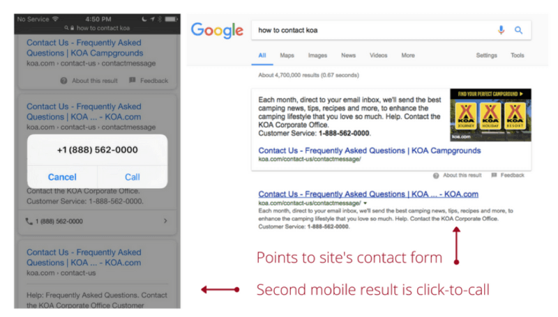
For example, a consumer searching for “how to contact KOA” has an “I want to know” query. On mobile, that person is more likely to click-to-call than to type out an email, which is the exact opposite of the desktop searcher.

A consumer searching for “where to get pancake mix” is in a moment to buy. On desktop, that person may very well be looking to order online, but they could also be open to pancake recipes or other related content. On mobile, though, you can assume that person is looking for a store nearby to complete the transaction immediately.
Even as mobile widens the gap in the coming years, there’s still a massive chunk of desktop traffic on the table for the taking, and now we can see that desktop and mobile each have their own SERPs space, too.
Bringing it all together: SEO content strategies for mobile-first search
- Perform keyword research for mobile devices. Customers search and behave differently between mobile and desktop. Voice search has become increasingly common, and users often employ different keywords or phrases when typing on mobile devices. As a very first step, it’s time to differentiate between your mobile and desktop keywords, so you can begin to better understand what your on-the-go visitors need and provide the right content in the best format for them. You still want to get those meatier, more in-depth pieces in front of desktop users and those further down the funnel, but not at the expense of your mobile users. Identify your keywords more likely to be used on mobile devices, then research the most likely user intent. See which micro-moment Google anticipates the user is in by analyzing the mobile SERP for that particular search. You can then develop brand content that best suits this type of user and ensure that it is completely mobile-friendly.
- Consider AMP implementation where applicable. Google continues to emphasize the importance of speed across devices. Recently, they also ended their instant search on desktop, saying they’ll be looking for ways to improve search speed across all devices. Beta updates with a stronger AMP flow-fixing tool have been released to the search consoles of some users, demonstrating Google’s commitment to enhanced page speeds. Brands should be paying attention to the potential benefits that AMP could bring them and mark up any appropriate pages.
- Review all site content to ensure that it is mobile-friendly. The content across your website should read easily or play smoothly on mobile devices. For example, an infographic with text too small to see on mobile can be designed to automatically scale to screen size. Users should also be able to easily enlarge the image if they want to see any more detail. Pay attention to navigation to make sure that moving throughout the site will not be a struggle for people using mobile devices. Google does offer a mobile-friendly testing tool, which can be used to get started on the path toward mobile compatibility. Overall, however, brands need to shift their mindsets away from creating desktop sites that “work” on mobile to creating mobile sites.
- Understand, differentiate and track desktop vs. mobile traffic, engagement and conversions. Enhance your tracking capabilities and KPIs for a more thorough picture, including what traffic arrives from mobile devices and what comes from desktop. Have your SEOs measure traffic rates, landing page visits, engagement rates, conversions and revenue rates for mobile devices separately, so you have a clearer picture of how well you’re reaching these mobile customers. As the market continues to shift more toward mobile, understanding how your mobile customers interact with your site will help you plan for these changes.
Clearly, users prefer their mobile devices at increasing rates, which means that brands need websites and marketing strategies that keep up.
Begin to focus first on your brand’s mobile users and make them the priority when developing content, rather than thinking first of desktop and then using minor adjustments to ensure mobile compatibility.
You can always provide more in-depth content for those who need it without sacrificing the mobile experience, but, as we’ve learned, you can’t simply make your site responsive and truly call it mobile-ready.
Some opinions expressed in this article may be those of a guest author and not necessarily Search Engine Land. Staff authors are listed here.
