At the recent SMX Advanced conference in Seattle, Google’s Tech Lead for its developer program, Maile Ohye, spoke on a panel entitled, “Complicated Technical Issues That Sabotage SEO Efforts.†(There’s an excellent write-up on it here.)
She discussed (among other things) the company’s recently announced changes to rankings in smartphone search results based on mobile user experience.

Consolidate your image optimisation strategy with your mobile strategy to best affect your SEO traffic.
Soon after, RKG chief product officer, and SEL contributing editor, Vanessa Fox produced an excellent write-up on technical SEO for mobile sites, in which she discussed different methods of optimising websites for different devices (in general URL architecture terms), including the benefits and challenges of each method.
Page Load Time Is Important For Mobile
Interestingly, one of the key takeaways of both Maile’s presentation and Vanessa’s write-up is that page load time has become a significant a ranking signal for mobile searches.
Google wants to provide mobile searchers with the best experience possible, and page response times are a part of this experience. This means that poor load times for mobile and smartphone users have the potential to negatively impact rankings to a greater degree than ever before — and that degree will only increase as time goes on.
This follows the trend we’ve seen for desktop searches over the last couple of years, with page speed being given greater weight as a ranking factor over time. However, it’s apparent that Google’s threshold for speedy page response times is much tighter for mobile and smartphone devices (sub 1 second) than it is for desktops (sub 3 seconds).
Responsive Design The Challenges For Image Optimisation
As a relapsed website coder myself, I find that responsive design is the most attractive solution for creating a mobile experience. It’s lightweight in terms of code and server impact, it’s easily executed and debugged, and it’s simple to maintain and support.
In short, if you know what you are doing, then it’s likely the preferred solution when building a website out from scratch — especially given that there are plenty of other ways to dynamically use your server’s processing power per page request (this is especially true for enterprise-level websites).
Given the page load time issue, a preference for responsive design might appear to sound the death knell for effective image search optimisation, given that the first casualties of responsive design websites are often large page assets (big images, basically).
Why? Because replacing the img tag with images called for via CSS removes the ability to optimise those images effectively with alt attributes and captioning. You also create a canonicalisation issue when listing multiple versions of the same image (each sized for different devices) with equal weighting (one each linked by its CSS file, called on page load using media queries).
The alternative — housing the image with the lowest file size in the img and then “switching it out†via the CSS for non-mobile devices — prioritises the lowest file size images, which typically fare worse for image optimisation. Google prefers to show bigger, better quality images where possible to facilitate user conversion (is an image searcher likely to click through the smallest, hardest to distinguish version of an image presented to them?).
So what? I hear you say. Who uses Google Image search anyway?
Well, according to Google (in informal meetings I’ve had with them on behalf of clients), ~10% of all searches are via Google Image search. It’s true that the click flow is much lower since the image search redesign – but even accounting for that, image search is a huge market.
If you also consider the relative lack of optimisation in image searches for many of the higher-competition marketplaces, as well as images’ ability to help convince browsers to commit to a purchase in e-commerce, it should be clear that neglecting image optimisation in your campaign would be criminal.
How Do We Optimise For Image Search Via Responsive Design?
Fortunately, we have some handy tools available to us to keep our code light, prioritise the best image, and scale beautifully for smartphones of all resolutions.
To deliver this robustly, we can use Fluid Image techniques developed by Ethan Marcotte to allow for smooth image scaling cross-browsers using CSS. We can then link to our preferred large image in the HTML (optimised for SEO in the standard ways) and use Adaptive Images (or an equivalent in your dynamic language of choice) to handle loading in appropriate image file sizes for your requesting device.
Et voilà !
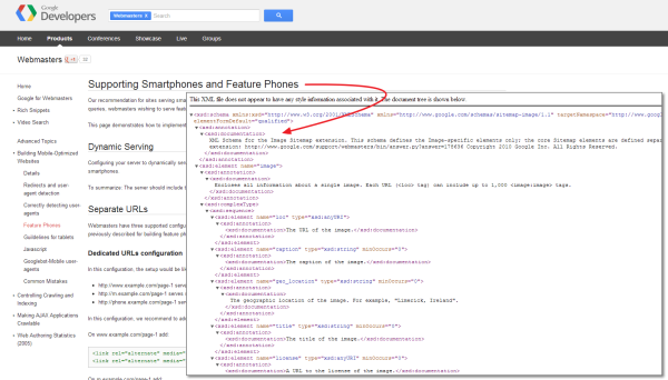
Being a belt and braces (that’s “belt and suspenders†to you Americans) sort of SEO, I’d follow up my selected image optimisation with a unique image sitemap listing the appropriate image URLs and their associated image:title and image:caption information to disambiguate my preferred file from any file indexed via stray or external linking.
Opinions expressed in the article are those of the guest author and not necessarily Search Engine Land.
Related Topics: All Things SEO | Channel: SEO | Multinational Search | SEO: Image Search | SEO: Mobile Search
