WordPress has grown and changed over the years, from a simple blog system into a full-fledged CMS. In that time, it’s gone from a basic white theme to a bright blue and then a more subdued grey and tan that we all know and love today. Along the way, it’s picked up a ton of features, and the world of computing has shifted from desktops to mobile and tablets. It’s time for some changes.
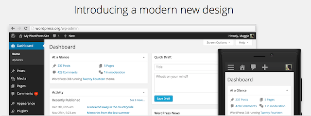
WordPress 3.8 is finally here today, and along with the extra new features and bug fixes you’d expect, it also includes a surprisingly nice new redesign that, while largely the same as before, makes the WordPress dashboard look far more modern and at home on any of your devices.

New versions of WordPress have come out far more quickly of late, thanks to the new plugin-focused development model where the main WordPress development is focused on the core of WordPress, and new features are more often than not shipped in plugins — the thousands of 3rd party ones, or Automattic’s own Jetpack that’s bringing over an incredible amount of WordPress.com features and more to the CMS. But that doesn’t mean the main WordPress install itself is being neglected. Instead, the efforts are being doubled-down on shipping quick, meaningful updates that make it better at what it does for everyone.
And today, that meant making the theme more modern. There’s the obvious new dash of paint, with a dark black sidebar, sharper edges, and the beautifully clean Open Sans font used throughout the app (though oddly, the post editor still uses Times New Roman for writing your posts, something that seems ready for a change itself). The entire dashboard is also now responsive, a huge step forward for WordPress since so many of us use it from mobile devices already. No longer will you have to use a far-too-basic mobile app to tweak a blog post or squint to tweak a setting on the go — WordPress’ dashboard now works great everywhere. That’s a hugely welcome change.

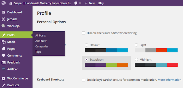
Most notable of all the changes, though, is the new color themes. If black doesn’t suit your tastes, you can always switch to a light (old WordPress style) theme, a darker and bolder Midnight theme, or even a blue or purple theme. The new colors are bold enough to look at home on a new iPhone 5c or Nokia Lumia — but they’ll also look great on your Mac or PC. The new themes may not pass the test of time, perhaps, but they sure do look nice right now.
There’s also other new features, including a new theme tweaking and preview screen that makes it easy to customize themes and see how they’ll look on your site. Overall, it’s the same old WordPress, but a bit nicer and a bit more modern.

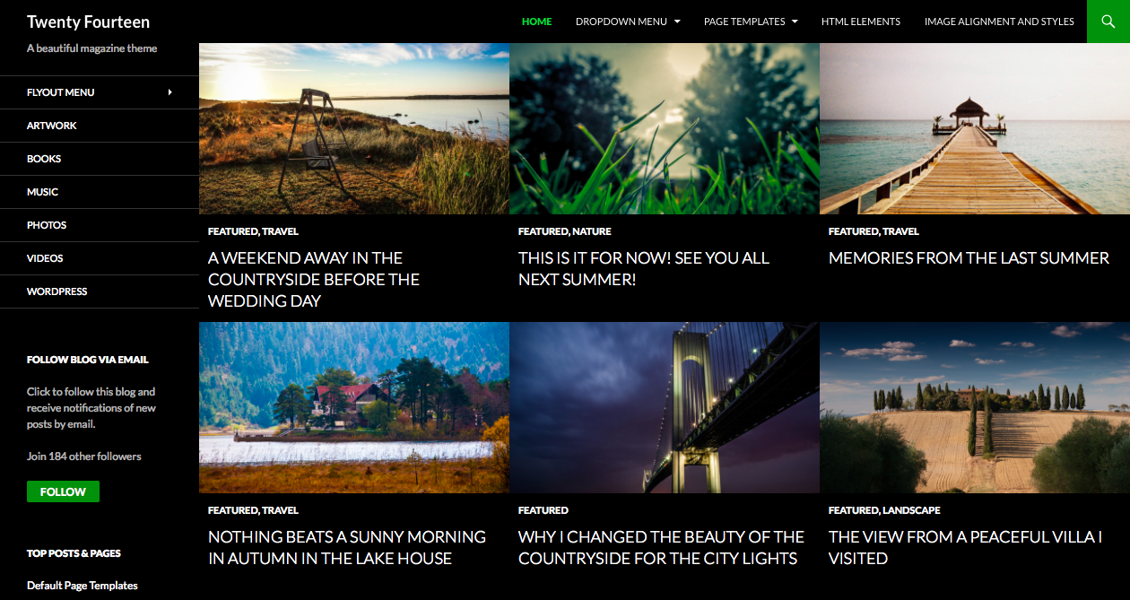
Then, no modern WordPress release would be complete without a new theme, and v3.8 is no exception. The original WordPress theme was used far too long, but that was changed in 2010 with the Twenty Ten theme that set a new direction for clean WordPress blogging. This year’s theme is another bold new direction, with a beautiful photography-focused magazine theme that looks surprisingly similar to a Windows 8 app with its all caps text and square menus. Its sidebar is perhaps the most unique, with full videos, quotes, and more that for once let you have a ton of content on a page without looking way too cluttered. Whether you’re starting a new blog with long-form writing accompanied by full-sized pictures, it’s the perfect starting point to tweak into your own personal theme.
WordPress is still, for most purposes, the default and best blogging platform. It’s great to have other options — I personally still love my Kirby CMS blog, and Ghost has a lot of people excited — but at the end of the day, it’s great to see WordPress continue to press forward and improve. Plus, after looking at the default WordPress grey for years, it’ll be fun to blog in, oh, purple for a while just for fun.
