
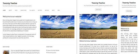
Meet Twenty Twelve, the latest default WordPress theme. Image: Screenshot/Webmonkey.
The default WordPress theme is quite possibly the most widely used design on the web; the minute you sign up for or install WordPress you have a website that uses the default theme. Every year WordPress unveils a new look that will grace every “just another WordPress site.â€
This year’s theme, Twenty Twelve, is the first to embrace responsive design, adapting its layout to fit any screen. The WordPress admin pages are already responsive, and the last few default WordPress themes have accommodated small screens, even using some responsive design tools like CSS @media, but this is the first default theme to fully embrace responsive design and fluidly adapt to any screen.
Twenty Twelve marks something of a departure for the default theme. Gone are the banners and featured images atop posts. Instead Twenty Twelve sticks with a largely black-and-white look that puts the emphasis on typography and a new typeface, Open Sans.
If you’d like to use Twenty Twelve on your WordPress.com site, just head to the dashboard and select Themes, (under Appearance). If you’re hosting your own WordPress install, you’ll soon have access via the Extend theme directory. And of course the new theme will be bundled with WordPress 3.5 due later this year.
This year’s theme was designed by former NFL player Drew Strojny, though as with all things WordPress there was plenty of help from the WordPress community. The WordPress blog has more details about Twenty Twelve and there’s a live demo you can check out as well.
Article source: http://www.webmonkey.com/2012/08/wordpress-launches-new-default-theme-twenty-twelve/