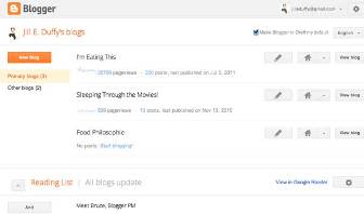
Google continues to roll out largely unannounced changes to its online empire, on Thursday going live with a massive redesign of Blogger, its free blogging platform. Blogger users will now be greeted with a clean and spacious white and orange layout, with more essential Blogger tools built directly into the main interface when they log into draft.blogger.com.
That “draft” site has been used as an early beta-like release called Blogger in Draft for several weeks now. Any Blogger user can opt into it.
Some of the changes, such as the rich text editor and new support for mobile versions of blogs, have been available to Blogger in Draft users for some time. But other changes, including the overall look and feel, are stunningly new.
Take Google Analytics, a tool that can be used on any website that delivers statistics about site traffic. It’s now built into the Blogger interface directly, whereas Blogger users previously had to launch the Analytics tool separately to access their data.
New buttons and icons also add to the streamlined and simplified look that complements other design choices Google has made recently to unify its brands.
For example, the new post screen, where users write the content of their blog posts, offers much more text real estate than ever before. A tab called “Earnings” with a trophy icon isn’t quite finished yet (a “coming soon” script appears when you click it) but seems to incorporate Ad Sense earnings—the money bloggers earn for hosting advertisements through Google—right into the main interface, too.
The search giant had hinted months ago that Blogger would get a facelift, as many other Google properties have, when it gave users a sneak peek at one very interesting change it had developed for blog readers in March of this year.
For the top stories in tech, follow us on Twitter at @PCMag.
Article source: http://www.pcmag.com/article2/0,2817,2388236,00.asp

